
1. Project Overview
Objective: To design an engaging and effective wrap packaging for Dynamite Wrap & Rolls, a quick-service food brand that specializes in wraps and rolls.
My Responsibilities:
Conducted market research and competitive analysis to identify design elements that appeal to the target demographic.
Developed a visual identity for the packaging that aligns with the brand’s playful and dynamic personality.
Created mockups and prototypes to test packaging functionality and user experience.
Collaborated with the client to refine brand messaging and ensure cultural resonance.
Goal: The packaging design should communicate the brand’s playful and energetic identity while enhancing the consumer’s experience with functionality and aesthetics.

2. Design Analysis
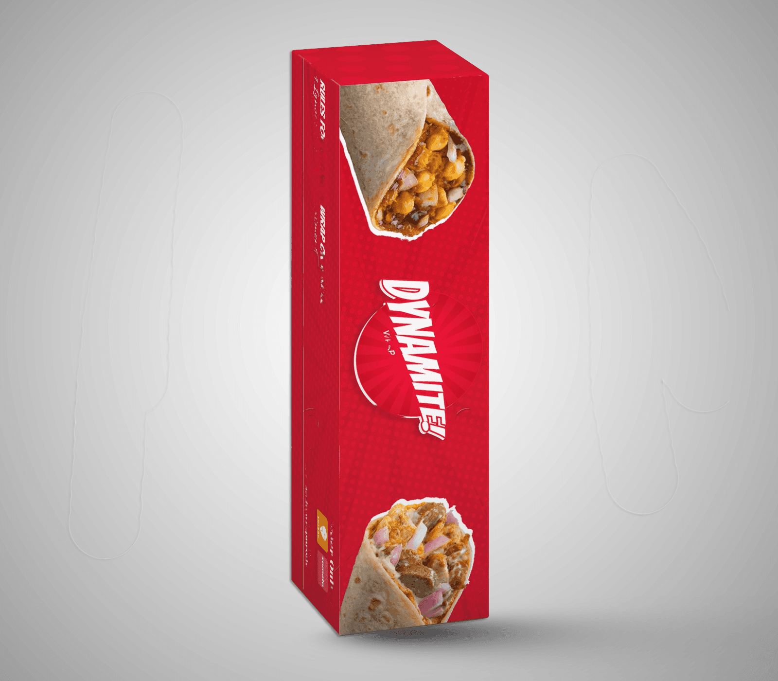
Visual Elements:
Color Scheme: Dominant use of red captures attention and aligns with the brand’s dynamic, energetic theme.
Red is known to stimulate appetite, making it an effective choice for food packaging, especially in a competitive quick-service market.
Typography: Bold, white font used to emphasize key phrases like “WRAP OR A ROLL,” creating a strong visual contrast against the red background.
The playful tone of the text adds to the brand’s casual, fun personality, setting it apart from more traditional packaging styles.
Imagery: Including images of wraps at both ends of the package gives a visual preview of the product, which entices consumers and sets clear expectations.
Brand Logo Placement: The Dynamite logo is prominently centered, ensuring brand recognition and reinforcing identity right from the unboxing experience.

3. Messaging & Copywriting
Playful Language:
Phrases like “Rules for eating a wrap or a roll — Ignore the above statement” introduce humor, making the consumer’s interaction with the product enjoyable and memorable.
Multilingual Appeal:
Using local phrases such as “Yeh Wrap Hai Rapachick!” adds a cultural element, enhancing relatability and connection with the target audience.

Call to Action:
Direct “Order Online” text, accompanied by Swiggy and Zomato logos, encourages engagement beyond the purchase, making it easy for customers to re-order.
Consumption Note:
“For immediate consumption only” adds a fun touch while subtly reminding consumers about freshness, enhancing the sense of urgency and quality.
4. Functional Design
Material & Structure Considerations:
While this case study doesn’t detail material specifics, it is essential for the packaging to maintain wrap freshness and warmth. The material should also be easy to handle and dispose of to cater to the quick-service audience’s needs.
Ease of Use:
A rectangular layout with well-spaced information ensures ease of handling and readability, preventing consumer confusion and enhancing the grab-and-go experience.
5. Target Audience
The design is geared towards young adults and food enthusiasts who value convenience, humor, and cultural connection. Vibrant colors and playful language resonate well with a youthful demographic, particularly those who enjoy flavorful, quick meals that offer an entertaining experience.

6. Brand Identity and Market Differentiation
Brand Personality: This design emphasizes a fun, quirky personality, setting Dynamite Wrap & Rolls apart from more generic fast-food brands.
Unique Selling Proposition (USP): The mix of humor and cultural language provides a memorable consumer experience, adding value beyond the meal itself and building an emotional connection with customers.

7. Conclusion
The Dynamite Wrap & Rolls packaging strikes an excellent balance between aesthetic appeal, brand messaging, and functionality. The humor and visual appeal reinforce the brand’s identity, while practical elements enhance the consumer experience, supporting the brand’s mission to create a dynamic, culturally resonant, and engaging quick-service option.